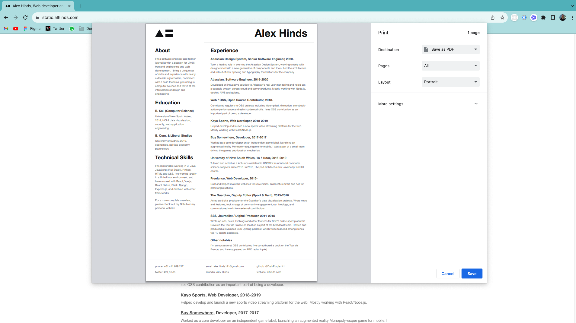
About five years ago I decided to remake my resumé from HTML and hosted it on one of my miscellaneous domains. Designing and building in HTML and CSS is something I enjoy doing - it's flexible and familiar so it was a fun little project and delivered a result that I was happy with. It also gave me a bunch of flexibility to leverage the same CSS across other personal branding web projects.
A key constraint was ensuring it could be printed on a single page - and I managed to achieve that with the following CSS:
@page {
  size: 210mm 317mm;
  margin: 0;
}
... and with some fine tuning on the size, and volume of content it prints correctly on A4 paper. If I ever needed a PDF for a recruiter I could print the page and voila, I had a PDF (I know, I know, I could have just made a PDF, but where’s the fun in that?).

Over the years I’ve made a few updates to the resumé, but the design and layout has mostly remained the same. It was bugging me though that it wasn't really a website. It was a PDF dressed up with some flavour. It wasn't:
- responsive
- accessible (there were all sorts of contrast violations)
- it didn't have dark mode (okay this is probably not necessary, but I wanted it)
So I did a revamp. It's live now at static.alhinds.com.
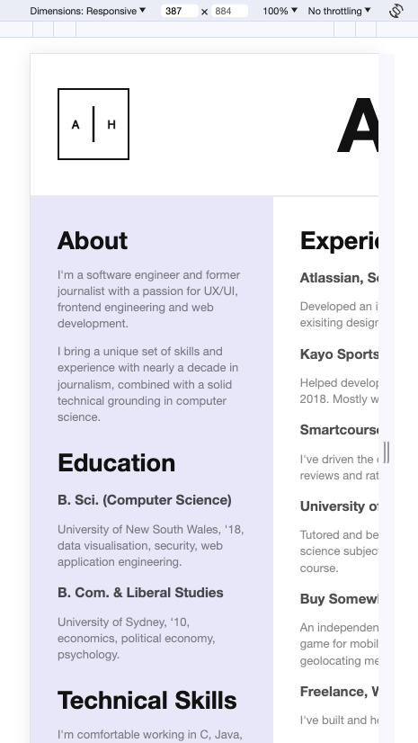
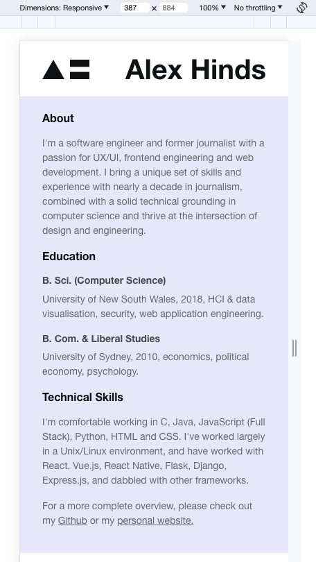
Before and after


Note this still prints at A4. I didn't change the HTML structure at all. What I did change were some of the design constraints (via CSS) for the mobile view. The key now is that all content flows in a column/block layout on all viewports, with some of the typography and spacing also scaling with the viewport.
Because I've been working heavily in the design system space recently I also coined a proper theme file for the site which I'm now sharing with this website too. This means all the typography, color and space requirements are defined in one place and this helps to keep the two sites in relative harmony.
You can read more of my writing here. You can also subscribe to my RSS feed here.